Telling Our Story
City flags have the power to tell a rich and vibrant story without using a single word. Through shape and color they speak to our history, our values, and our shared purpose. When residents fly their city's flag they are signaling a love for their home and a brotherhood with their fellow residents.
Unfortunately, in Philadelphia our shared story goes untold.
Great city flags are flown at sporting events, hung in our homes, and (occasionally) tattooed on our bodies. Meanwhile Philadelphia's flag is rarely flown outside of official functions. Philadelphia is a great city, it deserves a great flag.
Design Challenges
Philadelphia's flag is so rarely flown that many Philadelphians do not even know the city has a flag; fewer still are familiar with its design.
Flag of the City of Philadelphia
The city's flag was designed by a Philadelphia reverend, names Dr. Henery McCook, in 1894. He proposed that the flag should comprise the city seal atop a blue field with a golden pale. The seal itself was designed more than 100 years earlier in 1789. It includes symbols of peace, plenty, and justice along with the words "Philadelphia Maneto" meaning "Let Brotherly Love Endure." Although this is a perfectly appropriate seal for Philadelphia, this design does not translate effectively to the city's flag.
Seal
Philadelphia's seal is a complex and detailed image. The design is appropriate for printing on official documents, but it is far too complex for the city's flag. There are two main limitations of using the city's seal in this manner. First, seals are meant to be printed on a static sheet of paper seen from a few inches away. The seals complexity therefore does not translate to a wafting flapping sheet of fabric floating fifty feet in the air. Second, seals are only designed to be seen from one side. Flags, on the other hand, are seen from both sides so approximately half of the time the design will be backwards and text will be unreadable.
A typical observer, gazing up at Philadelphia's flag, could expect to see something like this:
Philadelphia's flag from behind and at a distance.
As you can see, at this distance all detail of the seal is lost, and with it, the flags meaning, symbolism, and relevance.
Successful city flags avoid this issue by avoiding seals and focusing on simplicity. Denver's flag, for example, uses simple symmetric design to convey a sense of place.
Denver's flag from behind and at a distance.
Simplicity is the hallmark of good design. The use of a complex seal limits the flag's appeal as a civic symbol.
Color
The blue and yellow on Philadelphia's flag are the city's official colors. In addition to these colors the flag includes well over a dozen additional colors including green, purple, white, and orange, all in the seal. These colors add to an already complicated design and create a busy, almost muddy, effect. The most effective flags use only a few basic colors. For example Washington DC uses only two colors to create a clear and identifiable design.
Washington DC Flag
Washington DC Flag Black and White
This design is so effective that it continues to work even in gray scale. Philadelphia's flag uses so many colors that it simply becomes a mess when converted to gray scale.
Successful flags use just a few distinct colors in their design. The complex use color in Philadelphia's flag robs the city of obvious civic colors and over complicates the design.
Distinctive
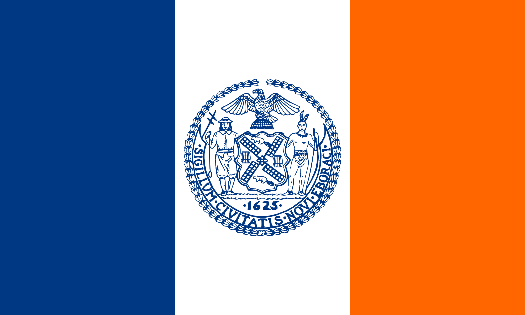
Successful flags must be distinctive and identifiable, Unfortunately for the Philadelphia flag, city seals on multi-color panes is an extremely popular design. Consider the flags for three of of our neighboring cities: New York, Trenton, and Pittsburgh.
New York City Flag
Trenton Flag
Pittsburgh Flag
No wonder Philadelphia's flag has been lost in a sea of civic seals and colored panes. Successful flags rely on unique designs to evoke the city's history and people. Philadelphia deserves a flag as innovative and unique as the city itself.


